An In-Character Programme
Last summer, I was producer for Grosvenor Light Opera Company’s production of Pirates of Penzance. For those that don’t know, most of the female roles in the play comprise Major-General Stanley’s adopted daughters. In many productions, they tend to be depicted as twittering Victorian maidens, all petticoats and parasols. We didn’t want that.
We based the design of our production on the Swallows and Amazons books. (This was before the new film came out!) The setting was updated to the 1930s. The daughters were to be intrepid, outdoors-y types, fully capable of having adventures and of taking care of themselves. We adorned ourselves with toy weapons, war paint, and head-dresses, in contrast with the pirates’ real swords. Here’s how we looked:
When we started thinking about the publicity for the show, I had the idea to make it in a style as if the girls had produced it themselves. For the poster, this meant breaking out the pen-and-ink. Here, I’m part way through — I had to start again because I smudged one of them:
But after some effort, I produced this design:
Some elements were traced from the illustrations in the Swallows and Amazons books, and I tried to do the lettering in the same style. The map, which does depict the actual location of Penzance, harkened to the maps that formed the endpapers of the books.
This poster definitely captured the style we were intending, and I was pleased with it. But we did have to get it scanned and professionally printed, which made them seem slightly less authentic. I’m sure nobody minded except me, but when it came time to do the programmes, I wondered if we could go further.
First, I borrowed a 1930s typewriter (the same one we used when I worked at Agant, to make the font for the Timeline World War 2 iPad app). On this I painstakingly typed out every text page that we required.
I had the cast hand-write their biographies (rather than the more typical “email me a couple of sentences” procedure we usually use!). I gave them precise dimensions to fit within, and backs of envelopes were duly pressed into service:
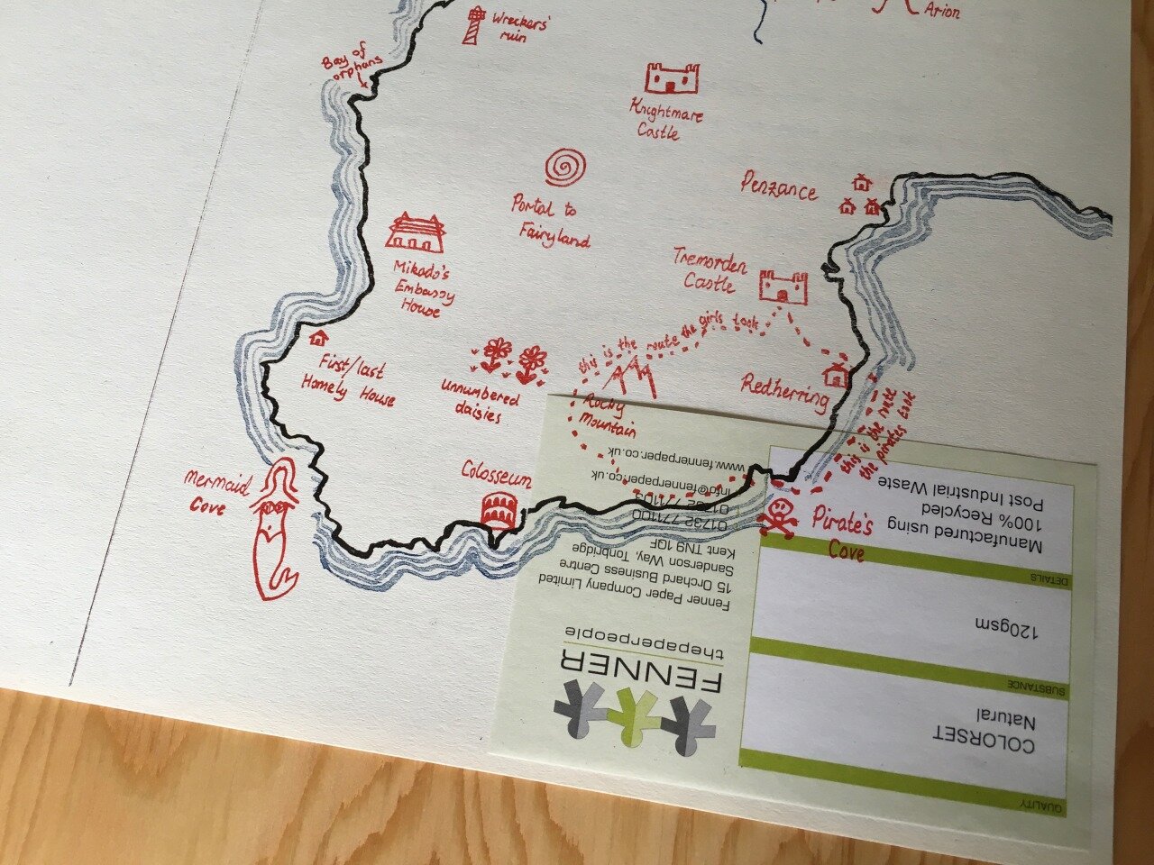
The front of the programme was to be a full map of Cornwall, with our own “alternative” place names upon it. I crowd-sourced these by printing out a bunch of maps, handing them around to the cast, and asking everyone to add some annotations and return them to me.
I wrote an introduction story for the first page of the programme, supposedly “in character” by one of the girls, to set the scene. This had to be typed out as well, of course. Frustratingly, it would have fit on one page rather nicely if I’d started a couple of lines higher!
Next, it all had to be assembled. This meant cut and paste. Armed with scissors and double sided tape (since it was less messy than spray mount), we painstakingly laid out each page of the programme. Actually, it was more painstaking than that — we made a separate sheet for each colour that would be printed on each page.
For the biographies, I could just cut them out and neatly align them. Typewritten pages gained hand-inked headers. A couple of illustrations were thrown in. And then there was the map for the front. For that, we traced it in ink, with separate sheets for the outline (pen and black ink), the sea (brush and blue ink), and the locations and annotations (done in black ink at this stage). A light-box came in handy for the tracing.
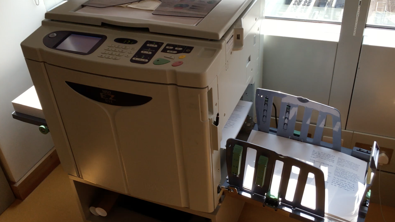
To print it, we used a Risograph machine, which uses liquid ink inside a drum. The outside of the drum has a screen, and ink is forced through the holes in the screen which correspond to the thing you want to print. The Risograph would scan your original document, etch a screen, apply it to the drum, and then print a bunch of copies. It’s one colour at a time, so to do multiple colours on one page you have to change the drum and ink, make a new screen, then feed all the pages through again.
Such a machine did not exist in the 1930s. However, all the individual processes that the Risograph automated, did exist. They may have been beyond the budget of the average teenage girl, but we’ll hand-wave that. I was proud enough that this document had never touched a computer.
One advantage of a Risograph is it’s very quick at printing. It does about 100 pages per minute. It still took an age, since for every colour of every side of every sheet, I had to make a new screen, feed the right stack of paper into one side of the machine, sometimes changing the ink colour, before setting it going.
Lining up multiple colours was an inexact process. I could usually get it accurate to within 2mm but no better than that. Again, for the thing I was making, that added charm. It also ensured that no two programmes were identical.
This is an ink drum with the screen wrapped around it. You can just about make out the writing on the screen:
This is the drawer where the machine disposes of the old screens. They’re made of plastic, and each one is used once then thrown away.
It turns out the Risograph is entirely happy to print over a label that is stuck on one of the sheets of paper. Oops!
Finally, after a lot of work, I had some stacks of programmes. You can see the map at the top of this article, and here’s what an internal page looked like:
I won’t say this process was easier or cheaper than modern computer-driven methods. But it was rewarding in a way pixel-pushing isn’t. I genuinely felt like I’d produced something with artistic merit, that I could hold in my hands and be proud of.
The show itself was a huge success too, thanks to a lot of effort put in by a lot of talented and diligent people. This coming year, we’re doing Iolanthe, which is an operetta about fairies and politics. I’m taking a break from being on the production team, and I’ll just be in the cast this time round. It’s a lot of work helping to put on a play, and if I’m allowed near any position of responsibility, I might find myself having some more ideas that turn out awesome, but require a lot of time and effort to achieve!


